
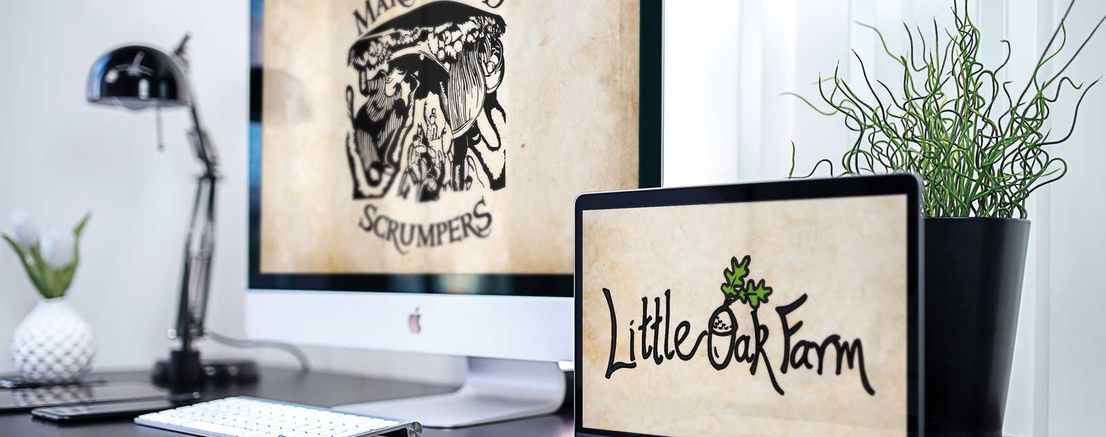
Little Oak Farm Label Design
THE CLIENT & THE BRIEF
Little Oak Farm is a small, privately-owned farm. Their ethos is to have high organic principles and a low carbon footprint. They take animal welfare very seriously and pride themselves on high-quality products.
The initial contact with the client, Mary, was via email. Within the studio, we pride ourselves on being able to interpret the creative brief effectively. Wherever possible, we try to speak to the client to gauge a fuller understanding of what creative is required. This also allows us to brainstorm ideas to make sure creative expectations are met and, wherever possible, exceeded.
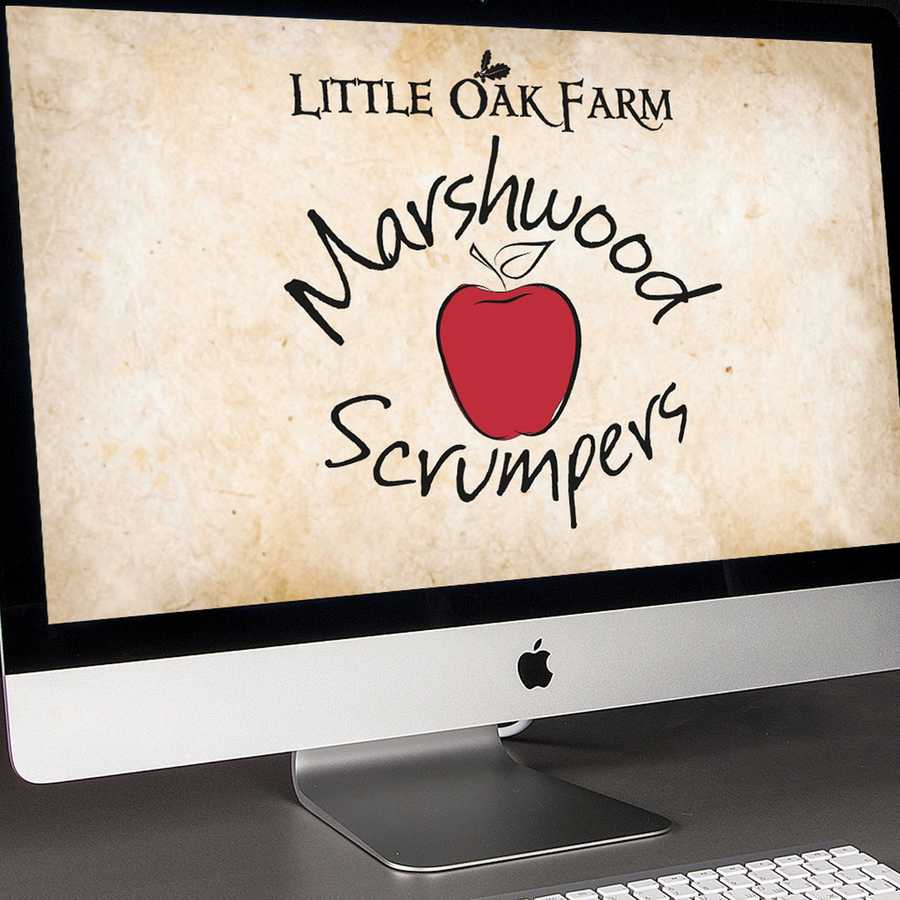
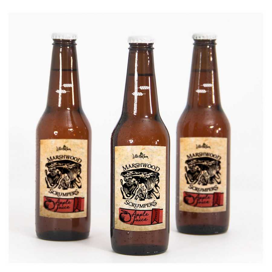
The initial brief was to redesign the labels Mary uses for the fruit juices. To establish a creative style that was not too corporate but gave the look and feel of an organic, bespoke-made product. The keywords to aid the graphic design creative process included: Authentic • Creative • Vintage • Unique • Old English.
THE SOLUTION
Firstly, we contacted the client to talk through their ideas and if they had any preference on what colourways to use. We gained from this contact with the client a more in-depth history behind the name and also learned that they wanted a traditional bread loaf as their pictorial logo.
We produced a series of designs in the initial creative design proofing process, then discussed with the client the positives of the designs and if any met their design requirements. Gaining feedback on the creative illustrations and typefaces, we were able to progress the logo design and refine the creative look and feel.
We produced the final design after four alterations to one of the chosen designs, all within the bronze design package that the client purchased.


Posted by Ben on May 12th 2021