
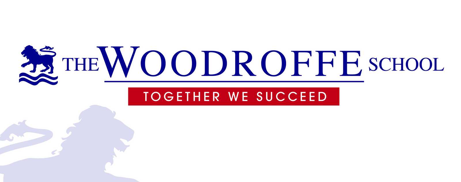
Woodroffe School Logo Design
The new Head of Woodroffe School came to us with the request that he wanted to update the look of the school’s logo. The brief was to create something fresh and new but also to have a traditional element that would represent the history and heritage of the school. The main goal was to to have an logo that the students and staff can be proud of. This then would be used across the entire school from signage to marketing.
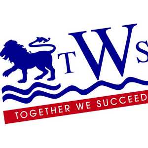
The colour ways were to be kept as the blue and red, with the lion also kept as part of the logo. Another stipulation was that the abbreviation TWS (The Woodroffe School) was to be included somewhere.
The challenge was to design a logo that had one foot in the future and one in the past to represent the tradition and the history of the school.
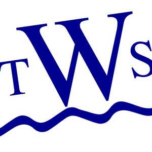
My first task was to recreate the lion and I wanted to do this sympathetically to the original, but making it more defined. Using this as a starting point I then looked at various typefaces to see how I could use this to represent, the past, present and future.
I also wanted to deepen the blue colour as I felt this would evoke tradition and heritage. A vibrant red colour would in contrast symbolise new beginnings and the future.
When designing, I firstly try and design an option that is safe and corporate. This is because I am aware that the logo would be looked at and agreed with the governors and I wanted my thought processes to be evident and clearly explained. Starting from a safe point of view I am able then to allow myself to go in a more creative direction.
For the main typeface I used “Times” although a very standard font I felt the depth and tradition that the font represents exactly matches what I was trying to communicate in the logo. Mainly tradition and heritage, but also that of high quality and respect. For the secondary typeface I have used ITC Avant Garde Gothic. A san serif font that is clean and simple. I used this typeface as I believe this represents the present and future aspirations of the school. With the backdrop of the bright red colour it creates a strong call to action and statement.
From the many logo iterations I designed I put forward my preferred option in a presentation to the Headteacher, explaining my thoughts and reasoning. Indeed, from this my preferred option was the one eventually chosen.
I designed two logo versions that can be used in marketing, signage and publicity campaigns.
A full logo that would be used for main headings in stationery and main signage at the school. But also a smaller more compact version utilising the acronym “TWS”, which can be used for smaller applications or where the larger logo was not appropriate.
When producing the main signage for the school I wanted the logo to stand out on a clean white background. The fresh white background symbolising a new start to the academic year with a new headteacher. I then used the Lion emblem as a water mark to add a contemporary feel but also to act as a brand asset when producing signage or marketing.
This has been one of those projects that has been a pleasure to be involved with and I am proud of the end result. In my opinion the new school logo will become part of the heritage of the school for many years to come.
For more information about the services provided by Creative Solutions, contact a member of the team today by calling us on 01297 630130 or sending us an email at sales@creativesolutions.co.uk.

View More Case Studies


Posted by Ben on October 23rd 2019