

Axe Valley Academy Canteen Design
Written by Leigh Jackson, graphic designer
Having produced a pasta concept before for the Academy, I was asked back to redesign their main canteen. The name concept was not as important as the actual look and feel of the brand.
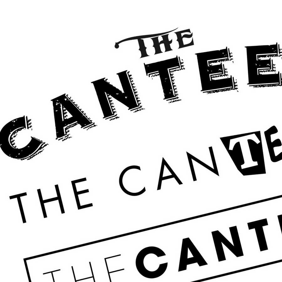
As the unit was to supply food ranging from sandwiches, pasta to hot jackets and so on, I decided to keep the name “The Canteen”. The retro / authentic quality this name evokes fits with the environment. The colour scheme was to be taken into consideration too, as the budget for the job was minimum - school finances are tight.
The only other stipulation was that the new brand needed to fit in with Owens coffee brand that was one of the suppliers. The main colour I wanted to use was a lime green as this symbolises freshness, which coincidently was the main colour of the Owens brand. It was common sense therefore to use a dark grey as the secondary colour.
I produced a series of logos adapting typefaces and different vintage shapes as I felt the 'Canteen' name suited something classic, so that it had longevity. We also decided to add extra design elements to complement the brand. This allows flexibility for furture developments without the need for a complete overhaul.
I wanted to create a young, friendly look and feel and to give the canteen a more clean and fresh look. This was to hopefully encourage the students to also eat more healthily, especially if they trust the brand, which then translates to trust in the product and produce.
For more information about the services provided by Creative Solutions, contact a member of the team today by calling us on 01297 630130 or sending us an email at sales@creativesolutions.co.uk.

View More Case Studies


Posted by Jedd on September 17th 2019