
Hart's Delights Logo Design
THE CLIENT & THE BRIEF
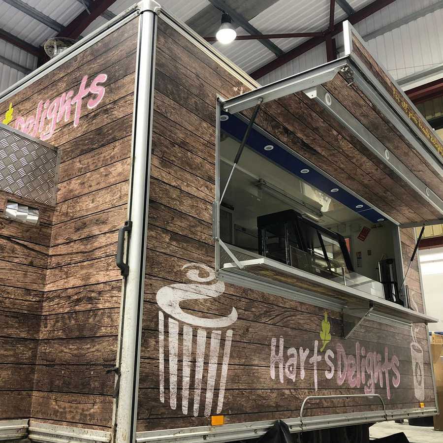
Hart's Delights is an independently-run catering business operating from a custom-made trailer.
The customer already had a name in mind and wanted a logo designed and also a look and feel of the entire trailer.
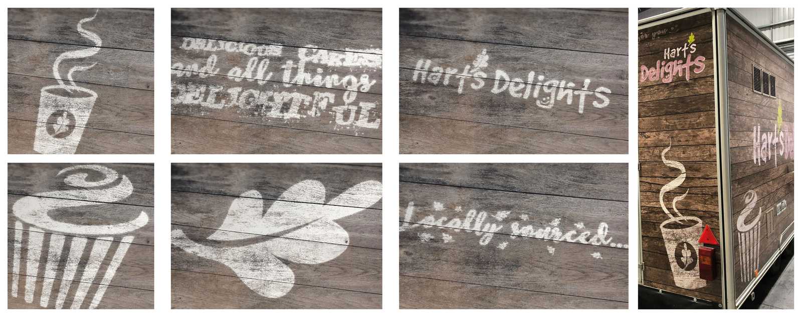
The catering trailer required stripping and re-writing. The main brief was that it was to be a luxury coffee and ‘treat’ unit for dogs walkers based at various locations.
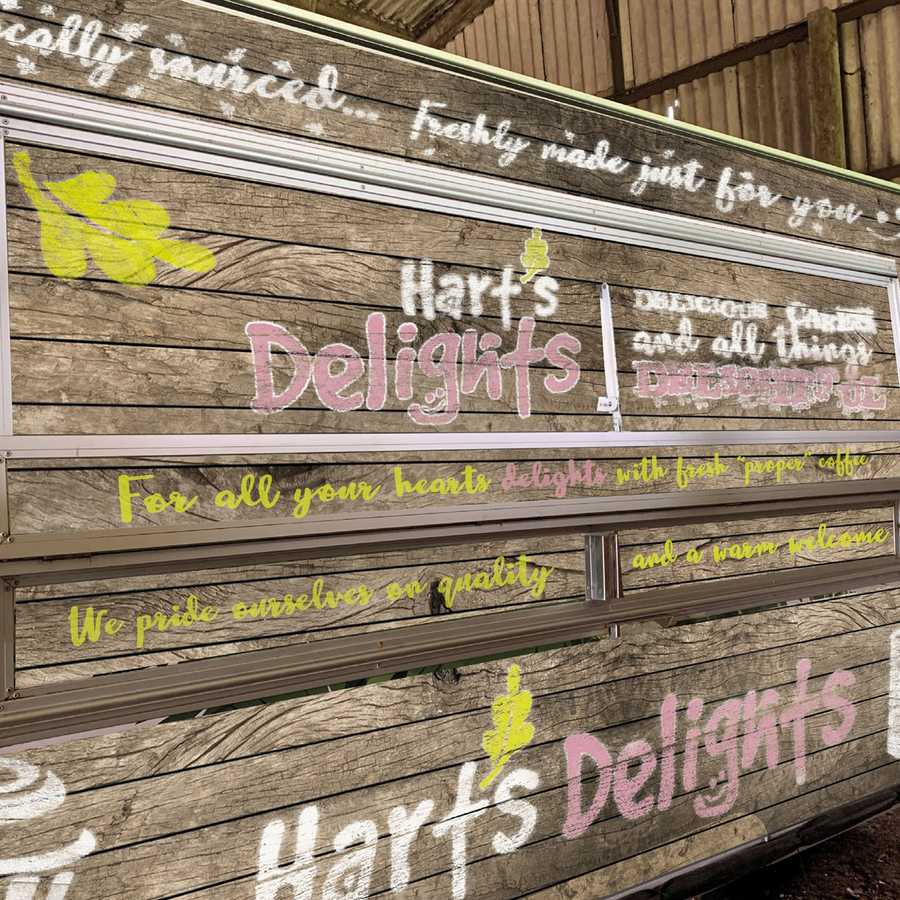
The offer was freshly-made cakes, sandwiches and hot snacks. Some of the items will be locally sourced. The client wanted something that looked in keeping with a woodland area so to be subtle, understated but also welcoming and have a recognisable identity.
THE SOLUTION
The studio decided that a rustic wooden look and feel would be the best approach. For the treatment of the logo, the brand needed to be authentic but would be enhanced with a playful and friendly feel.
The Studio produced various options and picked a recommended design. The client went on the recommendation.
As the main theme was to create a wooden effect, the Creative team did not want the logo just to appear on the wood without any thought. A texture was created to enable the logo to appear as if it had been painted on the wood. This style and creative approach was used for the rest of the text and icons.
The Creative team came up with the straplines that were used around the trailer. Using a play on the “Hart’s” and reinforcing the “Delights” message. Again, using friendly typefaces to create a friendly, approachable brand presence.


Posted by Jedd on May 7th 2021