
Kingsland Farm Logo Design
THE CLIENT & THE BRIEF
Kingsland Farm is a luxury South West Holiday Retreat. They provide a bespoke getaway. The studio has helped design their previous logos, for such things as their shepherds' hut “The Hideaway”, which offers a luxury weekend experience.
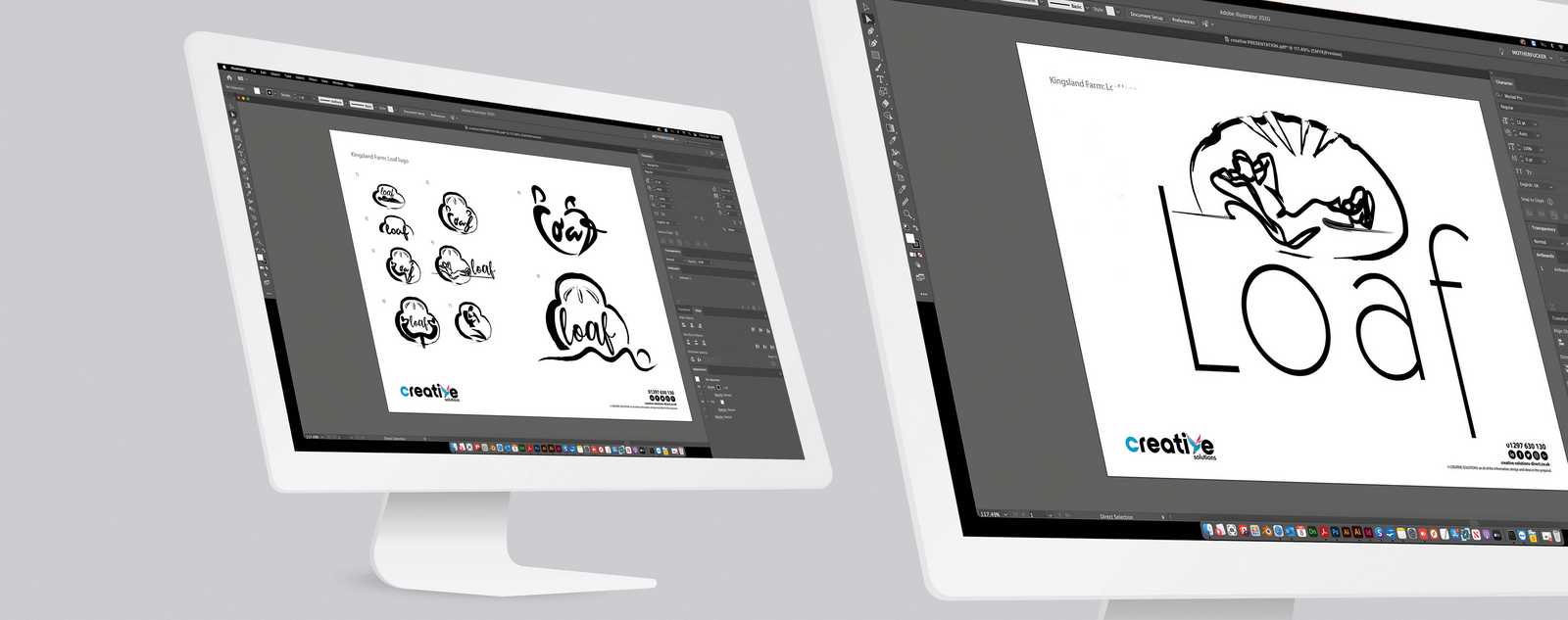
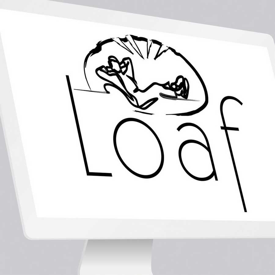
Kingsland Farm are adding to their accommodation in the form of a luxury barn conversion. At this stage, it was only for the loft space, so the offering needed to represent an ultimate luxury experience within an enclosed space. The name chosen was "Loaf" and needed to include images of people reclining in the logo design.
THE SOLUTION
Firstly, we contacted the client to talk through their ideas and if they had any preference on what colourways to use. We gained from this contact with the client a more in-depth history behind the name and also learned that they wanted a traditional bread loaf as their pictorial logo.
We produced a series of designs in the initial creative design proofing process, then discussed with the client the positives of the designs and if any met their design requirements. Gaining feedback on the creative illustrations and typefaces, we were able to progress the logo design and refine the creative look and feel.
We produced the final design after four alterations to one of the chosen designs, all within the bronze design package that the client purchased.


View More Case Studies


Posted by Jedd on May 7th 2021