
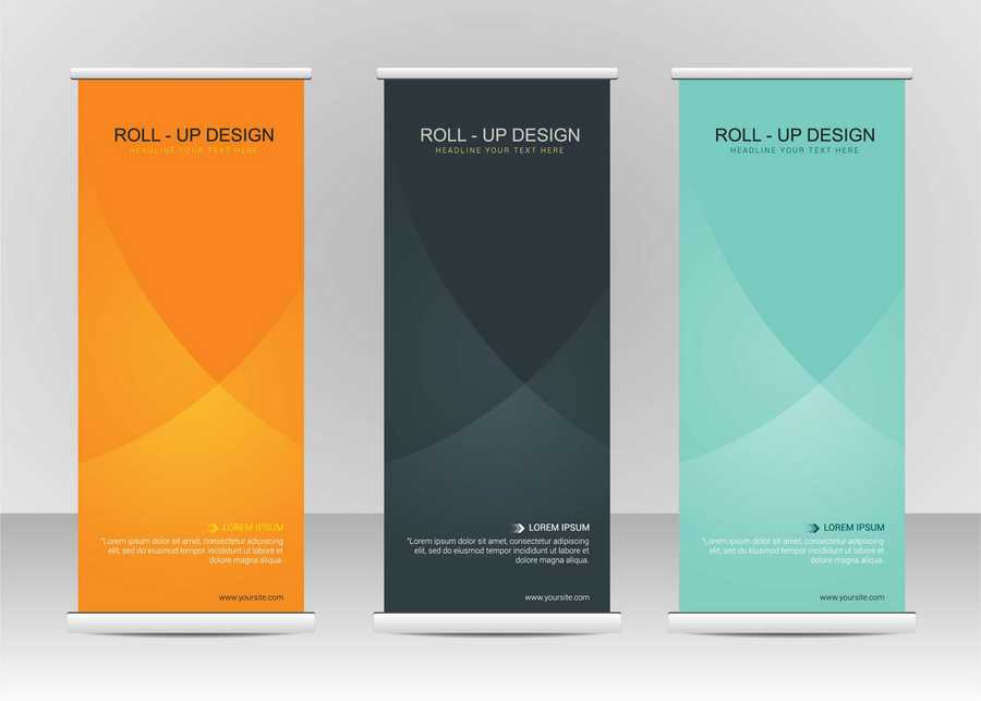
How to Design a Banner Stand
Banner stands can be used in a variety of different commercial environments and are an excellent method of making a striking visual impact to draw attention to your product, brand or event. Whether it’s creating point-of-sale material for your retail premises, advertising a trade show or art exhibition, choosing a high-quality banner stand is a great way of separating yourself from the crowd.
When investing in a banner stand, it’s vital that the design and layout are professional and well-executed. To generate just the right impact, there are some important aesthetic choices to consider to ensure this essential advertising tool is performing to its potential.
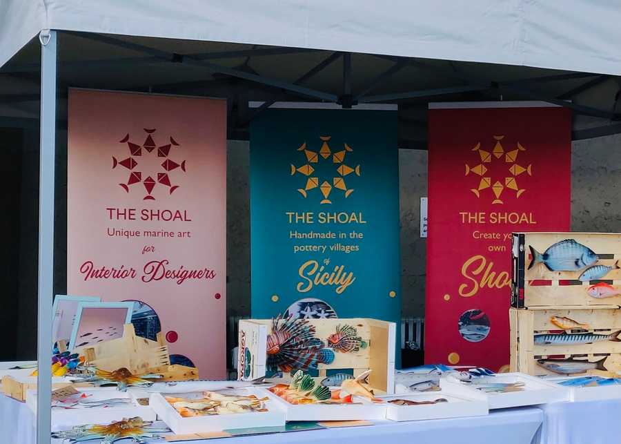
Make Sure You Get The Logo Positioning Right
Whatever promotional content you’re looking to include in your banner stand, perhaps the first cardinal graphic design rule is to display your logo and core message at the top of the banner. Think about where potential customers are likely to be positioned. The aim is to print key information—what you want the customer to notice first—at eye level.
A sharp, high-quality printed company logo is the most efficient way of grabbing the attention of passing foot traffic and stamping your brand in their mind. Creative Solutions have years of experience when it comes to banner printing and our designers will work meticulously with you to create a professional logo to your exact needs.
Work From Top to Bottom; Left to Right
Just like a book or newspaper, your potential customer is going to read your banner from left to right and top to bottom; so it’s important to bear this in mind when designing the layout of your banner. Ensure that there’s a natural visual rhythm to your content and that it reads easily. Also, your average passerby isn’t going to want to spend too much time absorbing massive blocks of text, so only include relevant information and keep the word count to a minimum.
Use High-Quality Images Wherever You Can
Images are a super method of adding visual depth to your banner and catching the eye of passing customers. If you’re going to include an image in your banner, however, it’s imperative that you choose one that is of the highest quality available and is printed professionally.
When choosing a banner stand with Creative Solutions, we can guarantee premium print quality for your images using state of the art digital printers. If you provide us with a high-definition photographic-quality image, we can assure you that every pixel will be captured in the banner.
Use Colour and Make it Pop
Colours should be a key feature of your banner stand; not just from a general aesthetic standpoint, but as a means to coordinate your branding or company logo. To create a strong visual throughline for your business, choosing colours that harmonize with other promotional material is essential.
Opting for bright, standout colours like reds and oranges is a safe bet, but always be sure to do a preliminary sight test to determine whether the content is readable and that there are no colour clashes. Just remember, with the professional print quality used by Creative Solutions, when you choose a red for your banner display, you can be confident that it’s really going to pop!
How can we help?
Creative Solutions have years and expertise and experience in providing our clients with high-quality banner stands, for a range of different needs and environments. If there’s anything you like to discuss, or would like any advice or guidance for the right type of banner for you, please get in touch.
Posted by Ben on March 10th 2022