Exterior & Interior Signage Refresh For Rise Bakery
Rise Bakery needed signage that worked harder at two key moments: first, out on the roadside where customers decide whether to stop, and then inside the space where speed, clarity, and a strong brand feel all matter.
The goal was to create a joined-up set of assets that made Rise easier to spot, easier to navigate, and easier to buy from – without adding visual clutter.
The challenge
The site has real-world constraints: a busy approach, competing visual noise from neighbouring businesses and road infrastructure, and a mix of environments.
Rise needed clear, legible messaging at a distance, then confident wayfinding signage once customers were inside. At the same time, menus had to be readable in changing light conditions and the operational flow needed clearer signposting for deliveries.
The solution
We delivered a cohesive signage package that follows the customer journey from arrival to purchase, keeping typography, tone, and layout consistent throughout.
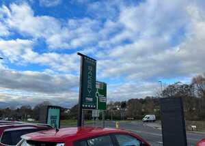
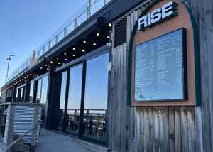
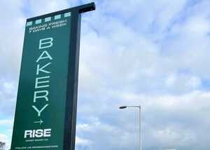
Outside, the priority was visibility and direction. The tall, vertical roadside sign (a panel/post-style sign solution) creates a strong “you’re here” marker, while supporting panels reinforce key messages (such as coffee hours and “baked fresh” style communications) so passing traffic can quickly understand what Rise offers and when.
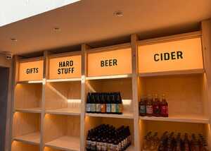
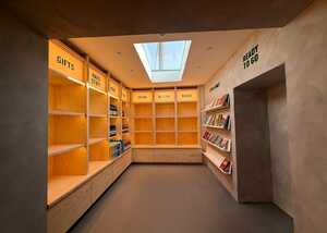
Inside, the emphasis shifts from grabbing attention to guiding customers smoothly. Interior signage integrated into the shelving system keeps navigation intuitive while maintaining a premium, uncluttered look. Additional wall lettering continues the same confident, minimal style and helps shape the flow of the space without relying on overly busy graphics.
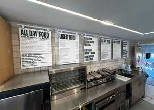
At the counter, the menu signage system was designed for speed and clarity. The multi-board layout uses strong hierarchy and high contrast so customers can scan food and coffee options quickly, reducing hesitation and repetitive questions during service.
Finally, we included practical operational signage, ensuring that staff and deliveries have clear, unambiguous direction – small details that make day-to-day operations smoother.
What we delivered
This was an end-to-end signage project that included:
-
Exterior roadside signage and supporting message panels
-
Interior category headers and wall lettering for wayfinding
-
A clear, high-contrast menu board system for the café counter
-
Operational signage to support back-of-house flow
-
Production and installation, coordinated as one cohesive rollout
The outcome
Rise now benefits from a stronger roadside presence and clearer direction from the moment customers approach the site. Inside, the space reads more confidently: categories are easy to find, the environment feels considered rather than cluttered, and ordering is quicker thanks to menus that prioritise legibility. The result is a consistent brand experience across retail, café, and operations – one system that looks intentional and works hard in the background.
Services used
Signage design, print/production, wayfinding, menu systems, fabrication, installation, and project coordination.
Looking for business signage in Dorset and the South West?
If you need a joined-up approach to branding across physical locations, we can help you plan the practical details and deliver production-ready graphics and signage.
View More Case Studies
Posted by Ben on January 30th 2026


