
10 Things You Need To Know About Logo Design
Think of 5 of the biggest companies in the world. It could be anyone- Apple, Google, Microsoft... anyone. Unless you've been hidden under a rock you'll be able to visualise their logo or their brand colours without too much hard work.
That's because they've cracked it! They've created a brand and a logo with such strength that any product with that logo on it immediately brings a certain amount of expectation. If you see a laptop with the Apple logo on, you expect it to be an Apple product and that brings a certain amount of predefined emotions or values that you associate with it. If you see a food packaged in the Tesco Value range, you know exactly what to expect and what sort of price you'll be paying.
That is the pinnacle of a well-designed logo. When a logo acts as a big megaphone for your company, you know you've got it right. It gives customers something to relate to and to help them understand your business. The font, colour size and shape of your logo all evoke certain emotions and affect the level of trust you'll get from customers.
So when you set out to design your logo, it's probably a good idea to give it some due care and attention. A professional and memorable logo can be the foundations that your brand is built upon. We should be thankful then that the guys over at bluesodapromo have created a fantastic graphic showing you 10 of the most important things to remember about designing your logo.
Don't forget, we have our very own design studio here at Creative Solutions. Our graphic designers have extensive experience in creating logos and building brands across the UK, so don't hesitate to use them as much or as little as required. They're here to help!
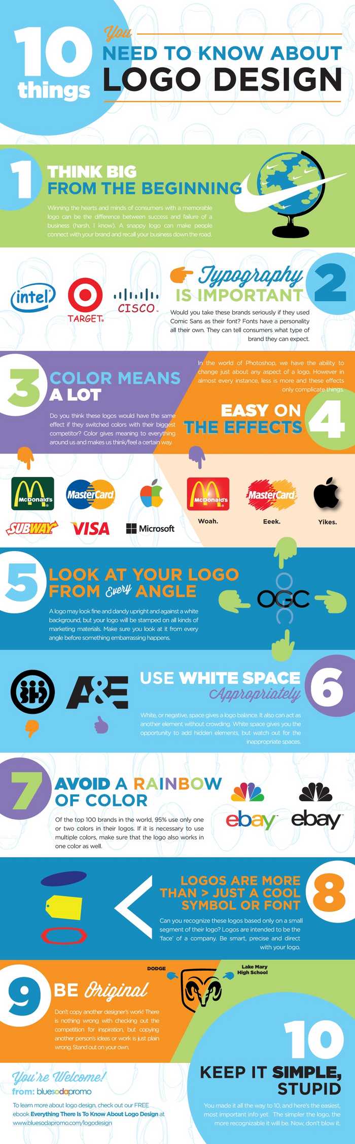
Image not loading? Here's the text!
1. THINK BIG FROM THE BEGINNING
Winning the hearts and minds of consumers with a memorable logo can be the difference between success and failure of a business (harsh, I know). A snappy logo can make people connect with your brand and recall your business down the road.
Identities are becoming less literal and instead more about the emotional connection one makes with it.
Pro Tip: Spend the majority of the beginning stages sketching. Your first idea WILL NOT be your best.
2. TYPOGRAPHY IS IMPORTANT
Typography is so significant it can make or break a logo. Fonts have a personality all their own; they can tell consumers what type of brand they can expect.
Pro Tip: Try at least 10-20 fonts before settling on one. Experiment with the size, spacing, and weight. You can even try creating your own custom font.
3. COLOR MEANS A LOT
Color gives meaning to everything around us and makes us think or feel a certain way. You also want to ensure that the colors you choose compliment one another.
Pro Tip: Color theory can be tricky, but a basic understanding on how colors work can be a big advantage for your business.
4. EASY ON THE EFFECTS
In the world of Photoshop, we have the ability to change just about any aspect of a logo. However in almost every instance, less is more and these effects only complicate things.
Pro Tip: If you choose to use one or more of these effects, your logo should not depend on it.
5. LOOK AT YOUR LOGO FROM EVERY ANGLE
A logo may look fine and dandy upright and against a white background, but your logo will be stamped on all kinds of marketing materials (check out Blue Soda Promo, its all we do!).
Pro Tip: Make sure you look at it from every angle before something embarrassing happens, you’re out a ton of money, and back at square one!
6. USE WHITE SPACE APPROPRIATELY
White, or negative, space gives a logo balance. It also can act as another element without crowding.
Pro Tip: White space gives you the opportunity to add hidden elements, but watch out for the inappropriate spaces.
7. AVOID A RAINBOW OF COLOR
Like we touched above, color is very important. Yet of the top 100 brands in the world, 95% use only one or two colors in their logos.
Pro Tip: If it is necessary to use multiple colors, make sure that the logo also works in one color as well.
8. LOGOS ARE MORE THAN JUST A COOL SYMBOL OR FONT
Logos are intended to be the ‘face’ of a company. They don’t necessarily sell a company or product, but over time help build trust.
Pro Tip: Be smart, precise, and direct with your logo.
9. BE ORIGINAL
Don’t copy another designer’s work! There is nothing wrong with checking out the competition for inspiration, but copying another person’s ideas or work is just plain wrong. Stand out on your own.
Pro Tip: If you succeed, the last thing you want is to have your logo mistaken for someone else’s.
10. KEEP IT SIMPLE, STUPID
The simpler the logo, the more recognizable it will be. Its #10 on our list, but should be followed from the beginning. Break your logo down to only the absolute essentials. Do you really need that background element? Are all the colors need? Is the name even necessary? All these questions and more should be asked before you present your logo to the world.
Credit: bluesodaproma
Posted by Ben on February 10th 2016