Designing Your Shop Front: The Basics
Attract, engage and seduce. Therein lies the answer to how to get customers through the door and in to your shop. As simple as that, no?
A successful shopfront grabs the attention of a consumer, it captivates them and makes them want to come in and see more. It’s a physical representation of your brand, and for a new customer, the first impression of what you have to offer. Behind the glass you might have the best products in town, but without the right exterior you’re losing significant business. Let’s delve in to what your store front says about your brand and business, and look at what can be done better.
1. Choose your Colour Scheme
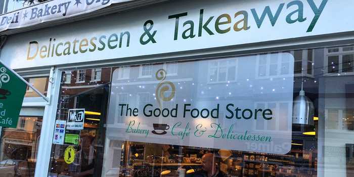
Sainsburys, Morrisons and Tesco. I’ll bet you can name the colour scheme for all three without much trouble. Think of any top company and you’ll see they have a clearly defined colour scheme, and it’s this that leads to customer recognition and trust. Bear that in mind when you’re designing your store front- be consistent and stick to your guns. If you’re not sure where to start, consider talking to a professional to make sure you get it right.

2. Plan your Lettering and Font Style
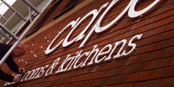
Are you looking to inform, inspire or perhaps both? This is where you can really get creative and stand out from the crowd. There’s so many options, commit the time to researching around and seeing how others are doing it and what you think works best. From the printed banner to brushed aluminium individual letters, whatever you choose needs to create a powerful impression. Boring signs are, well, boring. Think creatively.

3. Consider the Eye-line
The high street is bustling, people won’t always have the opportunity to look up at the main sign above your shop. Having different tiers in your shop façade maximises the chances of being noticed. Consider incorporating other marketing tools such as a-boards or window displays. They are an important supplement to the main sign, and can add further information to entice the customer inside. It’s important to recognise that you are trying to create value or delight for the customer, not force a promotion on them. Use these tools to show how your product can be of use to them, a pulling strategy rather than a push.

4. Don’t clutter it
One of the temptations straight away is to try and tell the customer everything there is to know about your business. ‘We do signage, large format printing, graphics, exhibitions, car-wraps, indoor and outdoor displays, designing and stationary all at the best price available. Also 30% off on selected lines!’ doesn’t really hit it off as our advertising model. In fact, you probably stopped reading after the first few words. Commit some time to making the shopfront as concise as possible. The interior is where you really showcase yourself, use the outside to make the brand strong and as memorable.

Whatever you choose to have on your store front, make sure it showcases the best of your business and don’t compromise on quality. If you’re struggling for ideas, fear not as we have an in-house team of designers that are more than happy to help you right the way through.
Creative Solutions have over 30 years of experience designing, manufacturing and installing signs across the UK.
Want to find out more about how Creative Solutions can help with your signage requirements? Click here to find out more or alternatively Contact Us for more information.
Posted by Ben on March 7th 2016

