Creative Solutions Rebrand: The Design Behind Our New Branding
Take a behind the scenes look behind our new company branding as our lead designer Leigh takes you through the intricate details on the decisions made throughout the design process.
"At the end of this year I had the opportunity to spend two days redesigning the “creative solutions” brand. As we are approaching our 20th year in business we wanted a fresh new brand that represented our core values: creativity, quality, customer service and value for money.
The initial design process I was given free rein to come up with some new concepts. I started this design process by firstly taking our logo and moving it forward in key stages. For example, experimenting with different typefaces and reducing the “solutions” wording so the focus was more on “creative”.
I presented my ideas in a pitch to the company directors showing these key design stages. This process allowed easy communication of my thought processes and this also allowed me to explain key design decisions I made with the brand. This could then be discussed in a critique and a final design could be generated from the feedback.
The final “creative” element was created and manipulated into a unique typeface. The final designed typeface I wanted to be similar in design to the previous logo but with a more contemporary and cleaner feel. This was intentional so that our existing customers would still recognise the brand and what it represents, and new customers would be attracted by the new design."
"One of my main goals was also to create an icon that would be instantly recognisable but also be integral to the logo.
I went though a wide range of ideas which I presented to the directors but my main focus was always to use a “Bluebird” as the icon.
Our main parent company is called “Bluebird Graphics” and I wanted this element within the logo. I designed various versions of the Bluebird until the final one was signed off.
I used this opportunity to use the industry standard colours CMYK, but showing this in a more subtle, creative and illustrative way that was not too cliched.
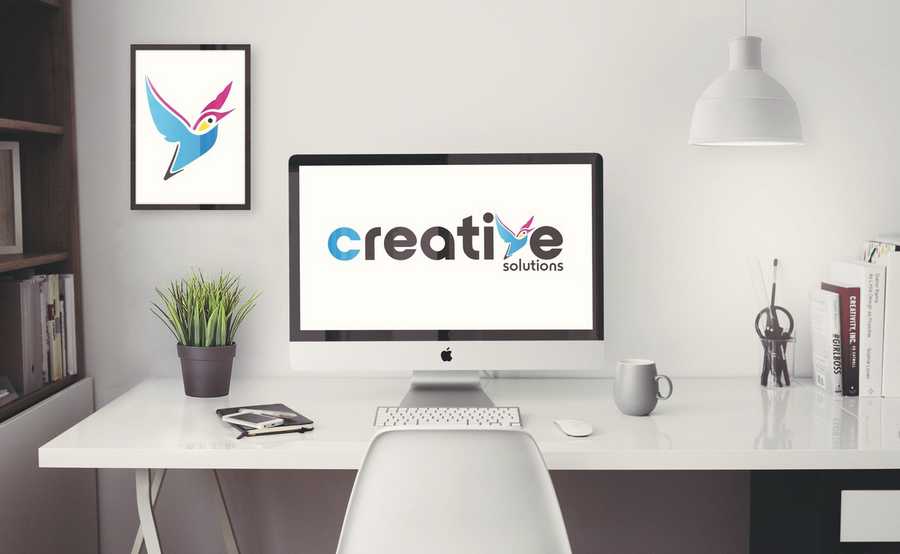
I designed the bird so that it could replace the letter ‘V’ so that the icon would be integral to the brand.
This icon can then be used on its own for a variety of creative applications where the full logo would not be appropriate from a design prospective.
Making the whole logo revolve round the word “creative” allows more future creativity when using the brand. The old logo was quite long and the message sometimes was lost when promoting what we offer primarily. The new logo allows our brand to take centre stage and be more visually visible.
I wanted the design refresh to reach new clients to show that we are actually a creative agency with a difference. Our main unique selling point is that we can generate creative design ideas but our other key strength is we can also produce the final products in-house, maintaining high quality. We can design for a wide variety of platforms and produce and install many products from promotional exhibitions to company signage.
Our new website is now live so...
Happy New year and stay tuned in 2018 for more creative ideas from “creative solutions”"
To find out more about how our design team can help your business branding, either visit our design page or email us at sales@creativesolutions.co.uk.
Posted by Jedd on January 2nd 2018


