
- Printing
PrintingOur in-house wide-format printing studio is set up to meet all your printing needs
- Signage
- ECO Range
- Exhibition
ExhibitionOver 40 years of industry experience in helping businesses showcase themselves at exhibitions.
- Outdoor Display
Outdoor DisplayMake the outdoors your own with our range of branding and display products.
- Indoor Display
Indoor DisplayDisplay your promotional material in a professional manner with our indoor display range.
- Notice Boards
Notice BoardsA huge range of fabrics, frames and colours to suit your exact needs.
- Whiteboards
WhiteboardsMassive range of whiteboard styles and sizes available, including our special custom printed whiteboards.
- Vehicle Graphics
- Pavement Signs
Pavement SignsPavement Signs, A Boards, Forecourt Signs & Swing Signs for all your retail display needs.
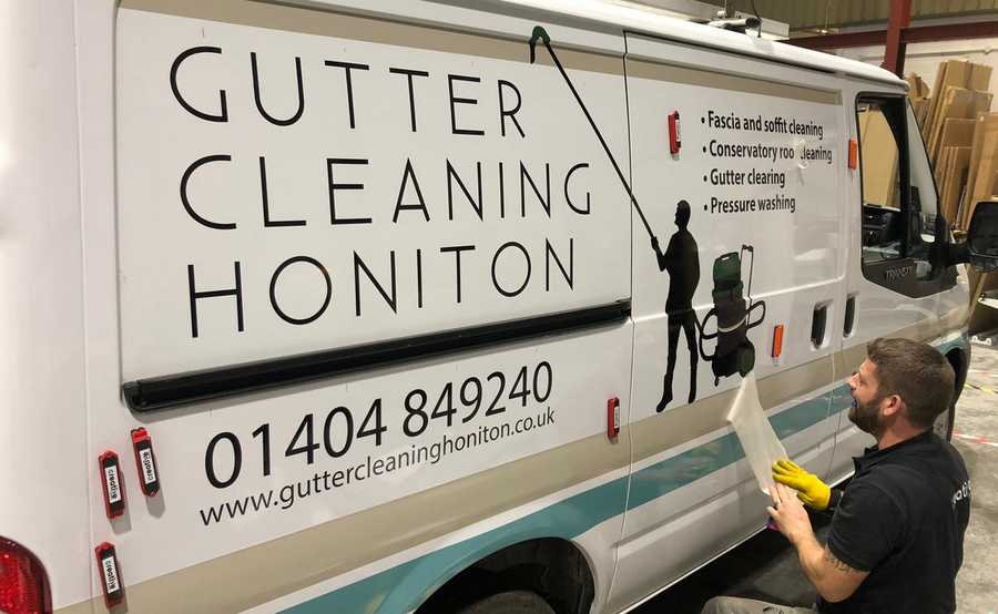
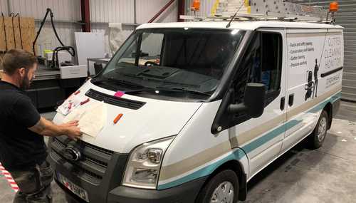
Van Signwriting for Gutter Cleaning Honiton
THE CLIENT
Gutter Cleaning Honiton operates in the market town of Honiton and numerous locations in the East Devon area, including Dunkeswell, Talaton and Awliscombe.
As well as clearing out your gutters, with expert precision and care, GCH also offer their customers soffit, guttering exterior, fascia and conservatory roof cleaning. Added to those services, they can now pressure wash your driveway and paths. In no time at all, they’ll have your outdoor areas looking brand new.
THE BRIEF
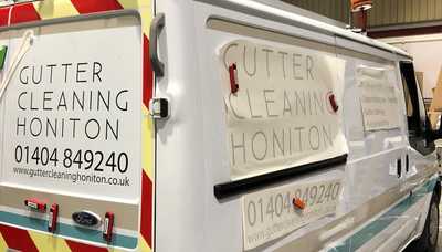
The client was looking for some new vehicle graphics for their company van, so contacted Creative Solutions to see if we could help. To give us a clear idea of what kind of design they had in mind, they provided us with a logo that they had already produced. Meanwhile, our design team began to plot where the main icon would appear on the van.
The logo was the silhouette of a man using a gutter cleaner. The aim of this simple design was to attract attention and provide potential customers with a clear idea of the nature of the business. The logo was in keeping with the straightforward, informative company name.
The client wanted to use simple colours, as to not confuse the message, and clean and precise typeface. When the van is stuck in traffic, it’s important that the public can easily read the signage.
THE SOLUTION
Once the final design was agreed upon, we went about printing and applying the graphics to the vehicle.
The van artwork was printed in full-colour white with cut vinyl gloss black for the company name, logo and service details. After cleaning the areas on which the signage would be adhered, the graphics were applied. On top of that, a protective laminate was applied to safeguard the vinyl over an extended period. The laminate is 100% waterproof.
We certainly hit the design brief for this project; the logo and typeface are simple, clear and precise. The branding is strong and it’s immediately obvious what services the company provides.


Posted on March 12th 2020


